Dynamic Type: Adaptable Layouts

Hello and welcome back to my series on Dynamic Type 👋
This time we’re going to talk about this guideline from Apple:
Use Dynamic Type and test that your app’s layout adapts to all accessibility font sizes. Dynamic Type lets people pick the font size that works for them. Verify that your design can scale and is legible at all accessibility font sizes.
Making responsive layouts is a good practice
There are many advantages in making your layouts responsive:
- You always have correct layouts no matter the available screen size (iPhone, iPad, multitasking on iPad, portrait/landscape, etc.)
- You ensure everything remains readable no matter the language and the length of translations
- You have a good foundation to scale your design and be legible at all Dynamic Type Sizes
So let’s take a look at some of these good practices…
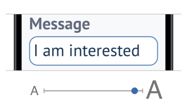
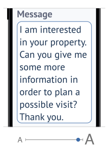
Make labels multiline by default
Each time you have to make a new label or are reviewing a design with your design team, ask yourself if the labels should be limited to a certain number of lines. Most of the time the answer will be: no.
Some common exceptions
- The top bar with the number of results and the two buttons could get too big if labels go on several lines. It would leave less space for the main content: the list of properties. So we constrain them to one line
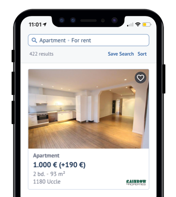
- Each property cell in the list has many labels that are all limited to one line. While they could spread on several lines if we really want to, all the info they provide will be displayed in its entirety in the detail page
Some multiline label cases
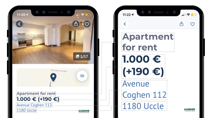
Inside of the property detail page, there’s no good reason to limit the number of lines of those labels. So if the text is longer or the Dynamic Type Size is bigger, they will nicely lay out on several lines.
When using label.numberOfLines = 0 we need to make sure the container view is not restricted in height in any way, otherwise the text will be clipped.I think we all agree the image above is much more readable than having all labels constrained to one line:
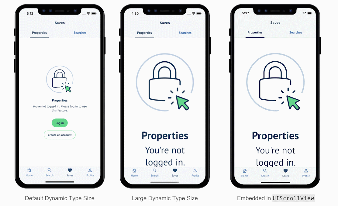
Make every content scrollable
Even when you don’t have a lot of content and it fits into the smallest iPhones, make sure to embed it inside a UIScrollView. By doing this, you make sure to avoid clipped content because it extends screen real estate in big Dynamic Type Sizes.
Update layout for Accessible Dynamic Type Sizes
On top of a responsive design, we can make some specific adaptations if we detect that the current Dynamic Type Size is an accessible size (one of the 5 biggest font sizes).
There’s an easy way to know if the current size is associated with accessibility: UIContentSizeCategory.isAccessibilityCategory.
Documentation
A Boolean value that indicates whether the content size category is associated with accessibility.
This property istrueforaccessibilityMedium,accessibilityLarge,accessibilityExtraLarge,accessibilityExtraExtraLarge, andaccessibilityExtraExtraExtraLarge. It isfalsefor other values.
When to use isAccessibilityCategory?
To make sure we respond to Dynamic Type changes while the app is running, we should use the traitCollectionDidChange(_:) method in UIView’s and UIViewController’s like so:
override func traitCollectionDidChange(_ previousTraitCollection: UITraitCollection?) {
	let isAccessibilityCategory = traitCollection.preferredContentSizeCategory.isAccessibilityCategory
	super.traitCollectionDidChange(previousTraitCollection)

	if isAccessibilityCategory != previousTraitCollection.preferredContentSizeCategory.isAccessibilityCategory {
		// Use isAccessibilityCategory to change your layout accordingly
	}
}
You could also choose to update a layout to a specific Dynamic Type Size. To do so, you can change the condition above to this for example:
if traitCollection.preferredContentSizeCategory > .accessibilityMedium { ... }Now let’s see a few cases where we can leverage this…
Horizontal → Vertical layout
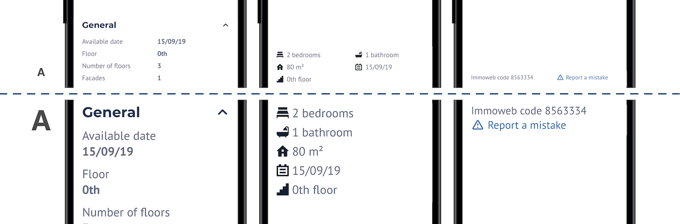
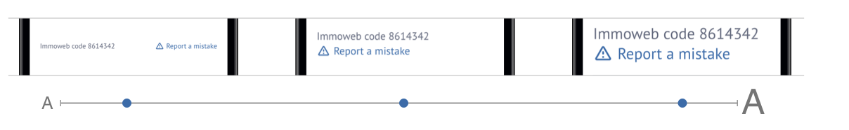
A common issue arises when laying out several components horizontally, next to each other. Here’s an example in the Immoweb app where we have two labels next to each other:
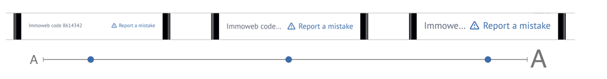
We can clearly see that by doing nothing more than just putting the labels side to side, it might look good at the default size, but we start to loose content as we go bigger. There’s definitely something to improve here.
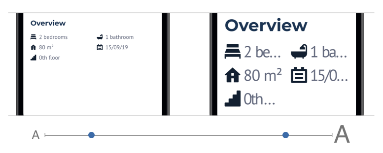
One way to fix that, as we’ve already talked about, is to make the labels multiline:
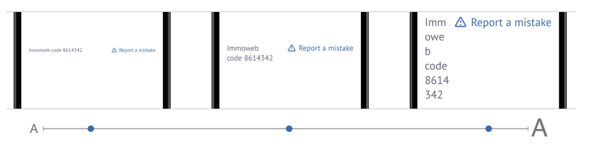
It’s already better, no content is clipped. But at big sizes it becomes unreadable as the “Immoweb code” label is written on 6 lines 😱
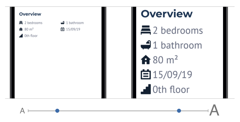
In those cases, keeping the labels multiline is a good thing, but we must go further.
The two labels are embedded in a horizontal stack view. By using the traitCollection.preferredContentSizeCategory.isAccessibilityCategorywe can decide to change the layout to a vertical stack when using accessibility sizes:
That looks good 🙌
Here’s what the end code looks like:
immowebCodeLabel.numberOfLines = 0
reportAMistakeLink.numberOfLines = 0

override func traitCollectionDidChange(_ previousTraitCollection: UITraitCollection?) {
	let isAccessibilityCategory = traitCollection.preferredContentSizeCategory.isAccessibilityCategory
	if isAccessibilityCategory != previousTraitCollection?.preferredContentSizeCategory.isAccessibilityCategory {
		if isAccessibilityCategory {
			stackView.axis = .vertical
			stackView.alignment = .leading
		} else {
			stackView.axis = .horizontal
			stackView.alignment = .firstBaseline
		}
	}
}
Simplify complex layouts
There are some cases where you might have a more complex layout than the one we just saw above. Here’s an example of a collection view with 2 columns. Everything looks fine by default but when we start raising the Dynamic Type Size, it becomes much less readable:
Like in the previous example, we’ll use traitCollection.preferredContentSizeCategory.isAccessibilityCategoryto decide to use one column instead of two when using accessibility sizes:
Much more readable 😎
Actually, this grid behavior has been simplified for this example. In reality, the grid can have from one to three columns depending on the size of the screen (small phones, multitasking, iPad). Added to that, we lower the number of columns depending on the traitCollection.preferredContentSizeCategory.isAccessibilityCategory.Min and max height for a UITextView
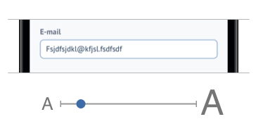
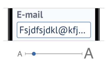
Another thing to pay attention to is using fixed sizes in your layout. Sometimes it can be ok (like for margins) but in the case of UITextView’s you have to define a height constraint (unlike UITextField automatic height). An easy call would be to use a fixed height, like 80, and it would look good at small sizes:
But again, at large sizes it causes an issue as one line of text can barely fit into the text view:
To fix that we can use the UIFontMetrics.default.scaledValue(for: 80)which we saw in a previous article. It will scale the height based on the current Accessibility Type Size. When using default size, the height will be 80 as before and at accessibility sizes the height will be scaled up. It will then look like this:
Now we can see the same amount of text no matter the Dynamic Type Size 👍
Scaled cornerRadius
While we’re at it, let’s go the extra-mile 🛫
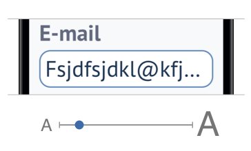
When using smooth rounded corners like in the text field above, it could be nice to have the same behavior as websites: corners radius scaling with the Dynamic Type Size.
Otherwise at big sizes, the corner radius will almost look squared:
To fix that, instead of doing layer.cornerRadius = 8, let’s do:
layer.cornerRadius = UIFontMetrics.default.scaledValue(for: 8)It looks better now:
But if the user changes the Dynamic Type Size while using the app it won’t update. For that, with the help of Rx, we can do:
extension UIView {
	private var scaledCornerRadius: CGFloat {
		get {
			layer.cornerRadius
		}
		set {
			let initialValue = newValue
			layer.cornerRadius = UIFontMetrics.default.scaledValue(for: initialValue)

			// When the preferred Content Size Category changes…
			rx.preferredContentSizeCategory
				.emit(onNext: { [unowned self] _ in
					// …we scale up or down the corner radius…
					self.layer.cornerRadius = UIFontMetrics.default.scaledValue(for: initialValue)
				})
				.disposed(by: rx.deallocating) // …until the view is deallocated
		}
	}
}
Then we can use it on any view: textView.scaledCornerRadius = 8 🤓
If you’re curious about the rx.preferredContentSizeCategory property we created with RxSwift, here’s the code:
import RxCocoa

extension Reactive where Base: UIView {
	var traitCollectionDidChange: Signal<UITraitCollection> {
		methodInvoked(#selector(Base.traitCollectionDidChange))
			.map { [unowned base] _ in
				base.traitCollection
			}
			.takeUntil(deallocating)
			.observeOn(MainScheduler.asyncInstance)
			.asSignal(onErrorRecover: { [unowned base] _ in
				.just(base.traitCollection)
			})
	}

	var preferredContentSizeCategory: Signal<UIContentSizeCategory> {
		traitCollectionDidChange
			.map { $0.preferredContentSizeCategory }
			.distinctUntilChanged()
	}
}
That’s it folks!
It’s already a good start to support Dynamic Type Size.
Remember to strive for quality and don’t forget to have empathy for your users ❤️
Thank you for reading. I hope you liked it!
Resources
- Dynamic Type — Apple Human Interface Guidelines
- Building Apps with Dynamic Type — WWDC Video
- Make your app visually accessible — WWDC Video
Other articles of the “Dynamic Type” series
Special thanks to Mohamed Louli and Vincent Martin for proofreading this article 🙏